Field Configuration
This is where you define the specific behavior and appearance of your Issue Picker field. You can access this page by clicking Configure for any field in the Main Panel.
Configuration by Context
To allow for greater flexibility and reusability of Issue Picker fields, we have introduced the ability to configure fields by "context." This allows you to apply different settings for the same field depending on the project or issue type, avoiding the need to create multiple custom fields.
How It Works
- Create Contexts in Jira: First, navigate to Jira's custom field settings and add the contexts you need for your Issue Picker field.
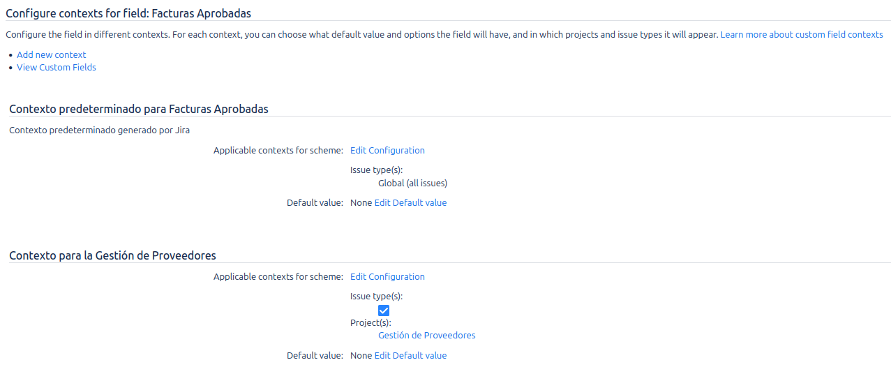
- Configure in the Add-on's Panel: Once in our administration panel, if a field has more than one context, you will see a new dropdown menu called Field Contexts at the top of the configuration form.
- Select a Context:
- Select a context to configure specific settings for different projects/issue types.
- The changes you make will apply only to the selected context.
- An asterisk (
*) next to the context name indicates that it has a saved custom configuration. - Contexts without an asterisk are
Using inherited configurationfrom the global settings.
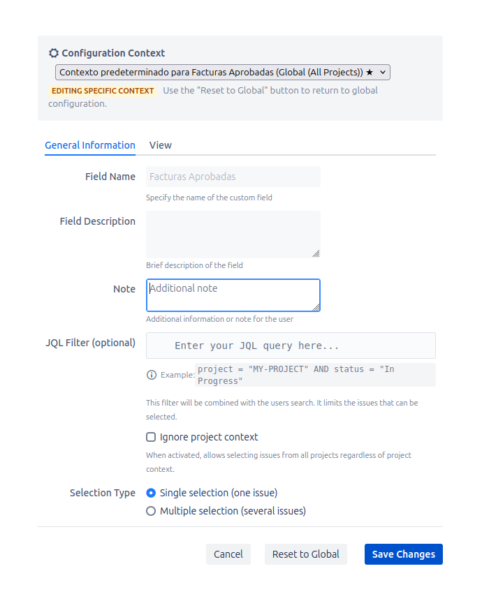
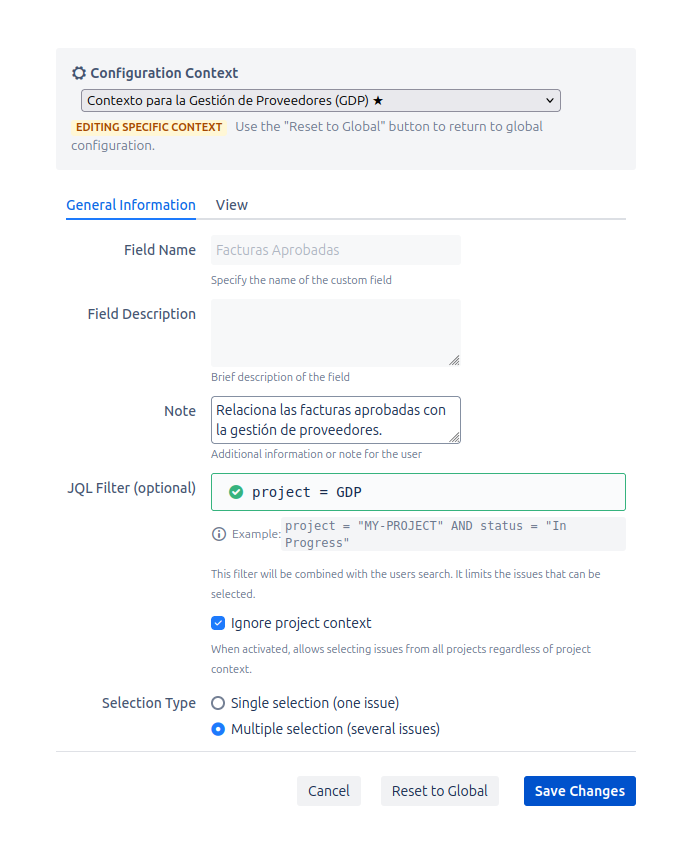
Editing a Specific Context
When you select a context from the menu, the form will update with its saved configuration (or the global configuration if it's the first time), allowing you to modify it. This mode is indicated by the text Editing specific context.
Reset to Global
If you want a context to revert to using the global configuration, you can use the "Reset to Global" button. This will delete the context-specific settings and it will inherit the default configuration again.
Once you have selected the desired context (or if you are using the default global configuration), you can proceed to configure the following tabs. The configuration page is divided into two main tabs: General and View.
General Tab
This tab controls the main functionality of the field.
- Field Name and Description: These fields are read-only here and display the name and description you set when creating the custom field.
- Note: An optional text area where you can add an additional note or instruction for users. This note is stored separately from the standard field description.
- JQL Filter (Optional): This is a powerful feature that restricts which issues can be selected in the field. The JQL you enter here is combined with the user's search.
- Example: If you set the filter to
project = "PROJ" AND status = "To Do", users will only be able to search for and select issues that are in the "PROJ" project and currently have the "To Do" status. - Live Validation: The editor provides feedback as you type. A green checkmark indicates valid JQL, while a red error icon will appear if there is a syntax error.
- Example: If you set the filter to
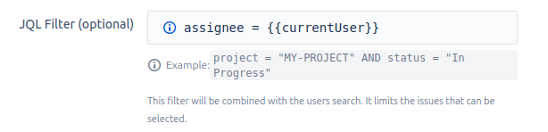
Dynamic Variables in JQL
To make filters even more powerful, you can inject values from other fields of the current issue into the JQL. This allows the JQL filter to adapt dynamically to the context of the issue where the field is being used.
The syntax for using a variable is {{issue.customfield_XXXXX}}, where XXXXX is the numeric ID of the custom field.
- Use Case Example: Imagine you have a "Main Component" field (
customfield_10200) and you want your Issue Picker field to only show issues that share the same component.- Your JQL would look like this:
component = {{issue.customfield_10200}} - When a user uses the Issue Picker field on an issue, the value of the "Main Component" field from that issue will be automatically inserted into the query.
- Your JQL would look like this:
- Ignore Context: Allows the selection of issues from any project the user has access to, ignoring the field's native context (its project and issue type settings). The user's viewing permissions are always respected.
- Selection Type: This setting determines whether users can select one or multiple issues.
- Single Selection: (Default) Users can only select one issue.
- Multiple Selection: Users can select multiple issues.
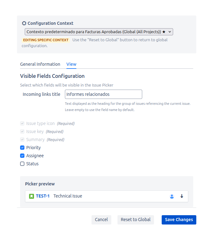
View Tab
This tab controls how selected issues and other user interface elements are displayed.
-
Incoming Links Panel Title: Allows you to define a custom name for the incoming links panel that is displayed in the issue view. If no value is specified, the panel will display the field name. This gives you full control over the panel's visibility on a field-by-field basis. This title is also context-specific: if the field has multiple contexts and each one defines its own title, the panel will honor the title of the issue's active context instead of always displaying the global title.
-
Visible Fields: You can choose what additional information to display alongside the selected issue's icon, key, and summary.
- Required Fields: The Issue Type Icon, Issue Key, and Summary are always displayed.
- Optional Fields: You can enable the visibility of:
- Priority: Displays the issue's priority icon.
- Assignee: Displays the assigned user's avatar.
- Status: Displays the current status of the issue as a colored lozenge (e.g., "To Do", "In Progress").
-
Live Preview: This section provides a dynamic preview that updates as you check or uncheck the visibility options above. It gives you an immediate idea of how the field will look to your users. For example, the preview will show placeholder icons for priority and assignee, and a sample status lozenge.
After making your changes on either tab, click the Save changes button to apply your new configuration.