The Capacity Planner View
The Capacity Planner view is the central visualization tool for team leaders and project managers. It offers a complete overview of the workload, availability, and utilization of a team's members over time, allowing for informed decisions about task allocation and future work planning.
Accessing the Planner
There are two ways to access the tool:
1. From a Jira Project
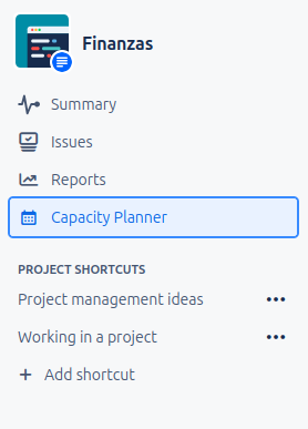
Navigate to your Jira project. If the administrator has enabled the plugin for your project, you will find a tab called Capacity Planner in the left navigation menu.
2. From a Jira Dashboard (v1.1.0+)
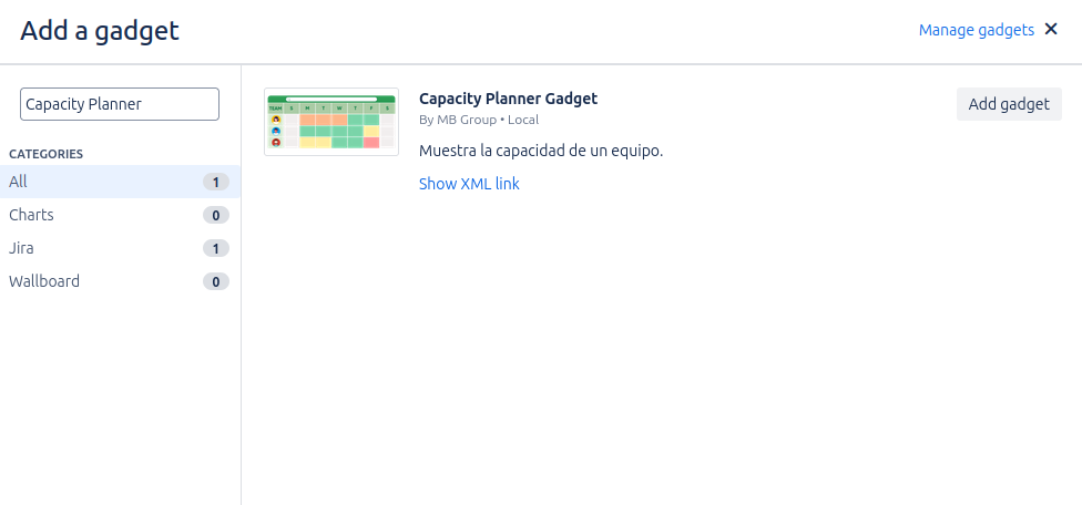
If an administrator has configured the Capacity Planner Gadget on one of your dashboards, you can view and use the planner directly from the dashboard.
Exploring the Interface
The interface is divided into two main areas: the controls and the planning grid.
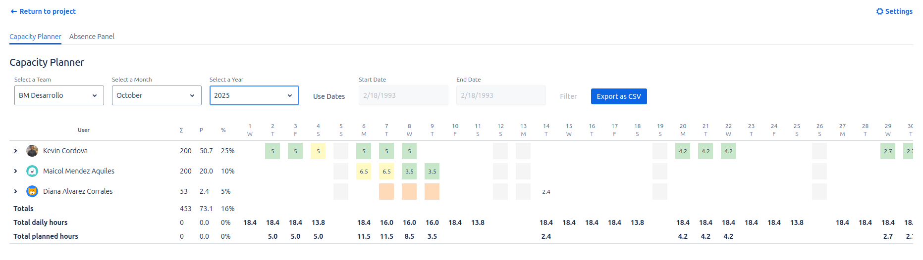
1. Planner Controls
At the top, you will find the filters to define the context of your analysis:
- Team Selector: Choose the team you want to analyze.
- Date Filters: The date control has been redesigned to offer greater flexibility.
- Month/Year Mode: This is the default mode. It allows you to navigate through time using the month and year selectors.
- Date Range Mode: Click Use Dates to activate this mode. It allows you to select a start and end date, showing in the grid only the days within that specific range. To return to the previous mode, simply click Back to Month/Year or refresh the view.
- Export as CSV: Click this button to download the current grid view as a
.csvfile, which can be opened in applications like Excel or Google Sheets.
Each time you modify a filter, the planning grid will update automatically.
2. The Planning Grid
This is the visual matrix that crosses team members (rows) with days (columns). The grid interface has been completely modernized to use native Jira components, resulting in a cleaner look and seamless integration with Jira's light and dark themes.
Issue Breakdown per User
To provide a deeper level of detail, you can now view specific issues that make up a user's workload and manage them directly from this view.
- How it works: Next to each user's name, you will find a toggle icon (
>). Clicking it will expand a table directly below the user's row. - Quick Issue Creation: A Create new issue button has been added to the header of the expanded table. Clicking it opens Jira's native creation modal, allowing you to add new tasks without leaving the planner.
- Table contents: This table lists the issues assigned to the user in the visible range:
Key: Issue identifier with a direct link.Summary: Issue summary or title.Assignee(Inline Editing): This column is now interactive. Hovering over the name or avatar reveals an edit icon. Click it to select a new assignee via an asynchronous search.- Permission Validation: The selector only shows users with permission to be assigned in the active project.
- Automatic Recalculation: Upon changing the assignee, the system updates the assignment via API and immediately recalculates the capacity bars in the top chart.
- Error Handling: In case of permission or network errors, a notification is shown, and the change is automatically reverted.
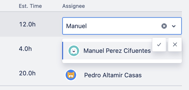
Status: Current status of the issue with its native Jira style.Start DateandEnd Date: Planned work dates.Original Estimate: Original estimated time for calculations.- Dynamic filtering: The list updates automatically when changing the date range in the top controls.
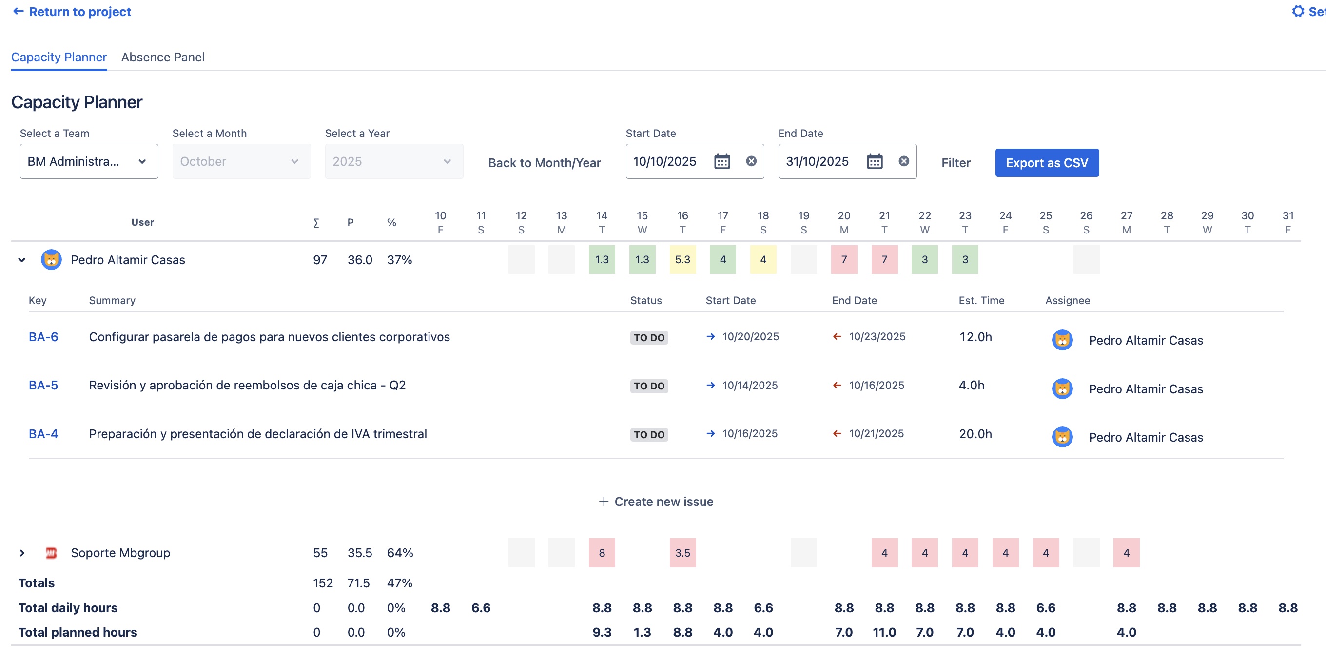
Workload Cells
The color of each cell acts as a workload "traffic light":
- Green: Healthy workload (below availability).
- Amber/Yellow: Workload nearing the limit.
- Red: Over-allocation. The assigned hours exceed the available capacity.
Status Cells
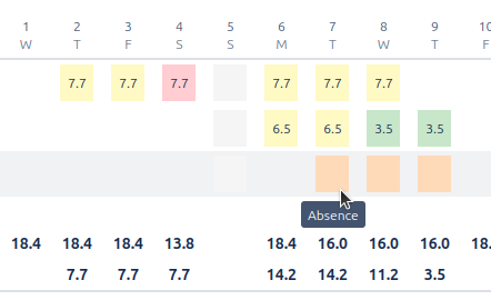
- Gray: Non-working day (weekend or holiday).
- Pastel Orange (full background): Full-day absence. Availability is zero.
- Top Orange Bar: Partial absence. The day's availability has been reduced by a number of hours.
- No color: Working day with no load.
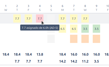
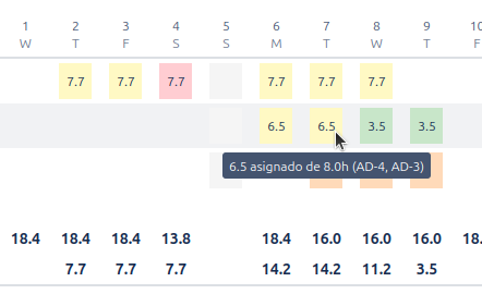
Tooltips: Information at a Glance
Hover over any cell to get a tooltip with crucial details:
- On a cell with hours: You will see the assigned vs. available hours and a list of the issues contributing to that load.
- On an empty cell: You will see the total available hours.
- On a status cell: It will confirm the reason (e.g., "Non-working day", type of absence).
3. Summary and Totals
The bottom and right side of the grid offer aggregated data for a macro analysis:
- Totals per Day Row: Sum of assigned and available hours for the entire team on each day.
- Totals per User Columns: Total sum of assigned and available hours for each person in the visible period, along with a utilization percentage.